
The following article is a guest post by Michal Leszczynski. Michal is immersed in developing, implementing, and coordinating all manner of content marketing projects as the Head of Content Marketing and Partnerships at GetResponse. He has 9-plus years of expertise in online marketing with a Master of Science Degree in Strategic Marketing and Consulting from the University of Birmingham (UK).
Got people to open your email?
Great job, but don’t pat yourself on the back just yet.
Your mission is to make that email count for something, to convert and bring new subscribers, customers, and fans. Achieving these goals with email marketing campaigns goes straight through one button: the Call To Action (CTA).
Before you read on - we have various resources that show you exactly how to use social networks to gain massive traffic and leads. For instance, check out the following:
FREE Step-by-Step Twitter Marketing GuideFREE Pinterest Marketing Ebook
An email CTA makes all the difference between a successful campaign and the one you’d rather forget existed. On the other side of each CTA resides the success.

So, how do you create an attractive Call to Action in email? How to achieve conversion rates so high you can’t wait to humble-brag about them on LinkedIn?
Below is a recipe that shows how to do it right — covering hows, whens, wheres, and everything in between!
The Anatomy of The Email
An email template containing a Call to Action needs to have a proper structure and a natural flow.
In broad terms, it needs to contain:
- An impactful subject line people won’t be able to resist. The way you introduce your offer matters as much as the offer itself, and the first impression really is the key.
- A clever opening line. Remember, before people open the email, the first couple of words can be seen next to the subject line. Marketers can use that to their advantage and pique the readers’ interest!
- Email body that promises something beneficial, guides them smoothly, and builds tension…
- …to the final blow: a prominent Call to Action! A well-designed logically placed button with tempting copy is a cherry on top of the email, a place where the magic of conversion happens.
Email Subject Line 101: A Couple of Tips to Get It Right
Email subject lines are too important to skip, that’s why email marketing services A/B test them; but as this article is about Call to Action, this section will be condensed and include vital tips:
- Don’t overdo it with slang and emojis — The line between sounding chill and natural and looking like a police officer “looking for some of that good stuff” on a festival is scarily thin.
People make appealing to a younger crowd look harder than it is. In fact, it’s completely fine not to use these two. But if you do, write as you’d normally speak, and use up to 2 relevant and illustrative emojis. The point of using emojis in the subject line is to capture attention and make better use of limited space. - Do the unexpected, or something different — Crack a good joke, ask an intriguing question, use a teaser or a cool reference. You know your audience the best (at least you should 👀). Think of something that will resonate with them and positively surprise them!
- No sensationalism, no lies — People are tired of seeing it in the media, don’t join the dark side. Imagine how disgruntled you’d be to rush and open an email promising something mind-blowing, only to find the most obvious, generic pitch. Just between us: I get so petty I instantly unsubscribe if that happens.
As far as sensationalism goes… Balance it out. Don’t be harsh, but don’t be sleazy.
Here are real-life examples from companies I didn’t banish from my curated inbox just yet:
Hey, before you read on - we have in various FREE in-depth guides on similar topics that you can download. For this post, check out:
FREE workbook: CREATE AWESOME BLOG POSTSFREE Beginner's Guide: START A BLOG

Your Opening Line is An Elevator Pitch
From what I’ve seen in my inbox and research, 90% of people forget this.
The first lines of your email are a logical sequel to the email subject line. Spoilers, if you will — and these “spoilers” play an important role in luring the readers in.
They can be:
- Informational, telling just a bit more about the offer, but not enough to reveal everything;
- Educational, teaching something valuable and suggesting there’s more where it came from;
- Emotional, whether it’s positive or negative;
- Personal, addressing the pain point and implying they need to keep reading to find the solution.
You get the gist.
You don’t say everything in the elevator pitch, and you don’t do it here either.
If the elevator pitch you had prepared is good, it will grant you prolonged contact.
If the email is captivating from the start, not only the recipient will read the whole thing, but they are more likely to accept your offer.
Email Body Surrounding the Call to Action: Make the Offer Look Delicious
Like a juicy steak adorned with some salt and pepper: rich, simple, high-quality, and satisfying.
Here’s how this lunch-time analogy matches the email body:
- It is the main course. No matter how sweet that CTA button is, they won’t stay for dessert if the main dish sucks.
The whole email is, in fact, your Call To Action. Email copy is a natural progression to the button-shaped conversion machine. You may write it in several ways:
a) Inverted pyramid: going from most to least important info;
b) AIDA (Attention, Interest, Desire, Action) — saving best for last: a bold choice reserved for the most skilled writers who know how to keep the readers on their toes and stay tuned till the end;
c) Doing what feels most natural: not all emails are the same. At the end of the day, only the writer knows what looks good for a particular email, and A/B testing will show what works and what doesn’t work. - It needs to match the entree. Remember that time you drank orange juice right after brushing your teeth? Some flavors don’t match. 🤢
Remember the earlier tip about misleading sensationalism and be sure to apply it. - Sometimes, just salt and pepper are enough. It’s a shame to ruin a sirloin steak with overpowering spices and hide its natural flavor.
The same applies to email body; don’t let the word salad hide your great deal. Keep the email copy clean and on the shorter side. - Is it palatable? Is it digestible? Endless paragraphs and walls of text are tedious to read. Instead, use bullet points where possible, shorten the sentences, and choose your words wisely: the space is limited and each word has (and should have) its weight and purpose.
- Looks matter, too. Use images to illustrate your point, and don’t forget to make them light so they load faster. Gifs are good too, but infographics are unparalleled — with valuable information presented in an eye-pleasing way.
(Confession time: if the plate decoration is edible, I’ll eat it and leave no crumbs. I paid for it!)
Create a Call to Action Button You’ll Be Proud Of
This is the emotion we all want to convey:

Below, we’ll show you how.
Ideal Position for a Call to Action Button
Some say left, some say right, in the end, in the middle, below or above the fol, but to create the best email marketing campaigns there’s only one rule of CTA button placement in the email:
Put it where it makes sense for your email copy:
- Above the fold is the most usual placement choice and still works fine, provided that you can fit everything relevant above the fold as well.
- Putting the CTA button at the end shouldn’t scare you! AIDA writing style has a natural progression, and scrolling as a physical action doesn’t require that much effort.
- It makes sense to put the button on the right; common logic implies it removes friction because most people are right-handed and use thumbs to scroll
- Never place the button in a crowded area, it will get lost!
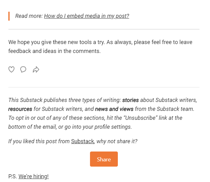
Button or Hyperlink?
Go for the button.
It’s a safe bet: buttons are aesthetically pleasing, far more noticeable, and people expect it and know what to do with it.
Links are easy to overlook because people have a tendency to skim written forms instead of reading thoroughly. They are also more difficult to click on the mobile.
However, you shouldn’t completely avoid links in emails. They do have their purpose: use them for secondary goals, and to enrich the text with something helpful — by linking to other landing pages, or useful content.
Image Button or HTML Button?
HTML buttons are superior to image buttons.
The latter might be more attractive, with more space for creativity, branding, and animation.
However, image buttons increase the email loading time. What’s most important, image buttons are susceptible to image-blocking from the email client, and this will mess up your CTA!
This won’t happen with the HTML button.
It is faster to load, won’t get blocked, and will still load and be clickable in case the server goes down, or the Internet connection is slow and glitchy. It won’t be as flashy as the image button, but making it visible is good enough.
What Kind of Button Design Makes the Call to Action Clickable?
CTA button design is kind of easy:
- Use bright, contrasting signal colors such as red, yellow, and sometimes green. You didn’t hear this from me, but it’s better to risk and make it an eye-sore than to blend it with the surroundings!
- Reduce friction. Give your button some space, and don’t place it in the “crowded area” — over a multicolor or patterned image, for example. Make it noticeable and clickable on all devices.
- Be brief. The bigger the sentence, the clunkier the button. There’s rarely a reason to make it longer than a seven-word sentence.
- Give them a reason to click. Make it obvious what they’re getting by performing the desired action.
When in doubt, do the “squint test”: take a look at your email while squinting and you’ll know whether the CTA button needs to be more visible. If it’s hard to notice, choosing a brighter color will do the trick.
What Should the Button Say?
If you’re confident your email body and offer are good enough, you don’t need to reinvent the wheel with button text. The usual will do — there’s nothing intrinsically wrong with “sign up”, or “subscribe here”.
But, it’s a bit boring.
Make this short text sweet and action-packed with words that allude to:
- Action;
- Mystery;
- Speed;
- Exclusiveness;
- Something new;
- Huge win.
How Many CTAs Can You Fit in an Email?
One button, one email, one goal = the best practice.
Too many options overwhelm people and blur their judgment: if there’s just one button, they’re closer to making the decision to click it.
Two or more buttons may divert the attention from your goal, but there’s a way around the “one button rule”.
That’s right — use hyperlinks!
Links are integral parts of the text and won’t divert the attention too much, so you’re free to add a couple of them.
Remember to Optimize for Mobile!
Our last important tip is never to forget about CTAs for mobile.
More and more people use mobile to complete converting actions. Everything that may annoy the recipient will make some of them give up, and that’s the easily preventable risk.
To make CTA emails for mobile not annoying, study CSS media queries (or get someone to do it instead of you). CSS is responsible for styling and covers all bases when it comes to mobile-friendly email design.
Conclusion
The most important takeaway from this whole piece is: the whole email is an integral part of your Call to Action, and each word counts.
Let’s summarize with a checklist:
- Start with a cool subject line;
- Follow up with an “elevator pitch” condensed into the first sentence, so they open and keep reading;
- The email body should have a natural progression and an inviting storyline, so readers stick to the end without any effort;
- The email text should be palatable and easy on the eyes, with good formatting — bullet points, short sentences, neat layout;
- CTA button placement is highly contextual and goes along with email flow, so the placement will depend on the information readers get before running into the button;
- The best shape for CTA is an HTML button in contrasting color, so it’s noticeable enough;
- It would be best to have one button per email to keep the focus on the most important thing, and spice things up with a couple of hyperlinks for secondary goals;
- Use CSS media queries to optimize the email for mobile.
And just like that, you’re ready to create emails with irresistible Call-to-Action for every email marketing campaign! ⭐